


How To Bring Color Into Your Home
Learn How to Infuse Color Into Your Home With Our Houston Interior Designers
Color! Oh, the wonderful world of color! Color is a powerful tool in the world of interior design. Deciding where and how to bring color into your home can be an overwhelming task, but our team of Houston Interior Designers are here to help! Our Design Manager, Danna Smith, took a deep dive into some of our projects so we could share color tips with you.
Colors are always changing from one room to another, and the colors you choose depend on what other colors are already present in your space. The implementation of color may not change your space drastically, but can change it subtly. Colors can look very different in the daylight and at night. People also view color differently and have different preferences. Our job as designers is to help our clients select the best color combinations for their homes.
When choosing colors for your home, there isn’t ever a wrong answer. What can be unsuitable, however, is the amount or intensity of a color in a particular space. Color sets a space’s mood and ambiance, and so many color combinations can be achieved.
At Pamela Hope Designs, we love manipulating those combinations in their different strengths to create beautiful spaces for our clients. It’s important to remember that colors don’t necessarily have to be on the walls. You can bring them in through the furnishings, fabrics, window treatments, and accessories. The colors in your home will change from daylight to night and throughout the day, so just because it looks great in the showroom, it may not be the absolute true color in your home. We can help you determine what colors look best in your home. Let’s take a look at some of the colors we love!
QUICKLY ADD COLOR WITH PAINT
Painting the walls of your space is the most effective way to achieve a new fresh feeling to your interior without having to invest a large sum of money. A painted wall can not change the size of a room but it can certainly change how you perceive it. Lighter colors recede, which makes the walls appear farther away from us. Darker colors advance, which makes the walls appear closer to us. The same room can look completely different depending on the paint colors selected.
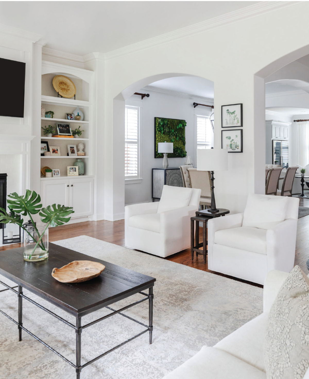
We like to paint the main parts or rooms in the home a lovely neutral color so the furnishings can be the focal point. Often, the best neutral will be a white. One of our favorite colors to use on the walls for our interiors is SW 7004 Snowbound. Snowbound is a versatile neutral color that has a hint of a chalky appearance, not too stark white and not too gray. This paint color is lovely and gives the space a clean and fresh look.
We completed a beautiful home for one of our clients in the Upper Kirby area and used SW 7004 Snowbound for the entire house. She preferred a white-on-white transitional style home, and this was the perfect color to use. We loved the way it turned out, and she did too!
CREATE AN ACCENT ROOM WITH COLOR
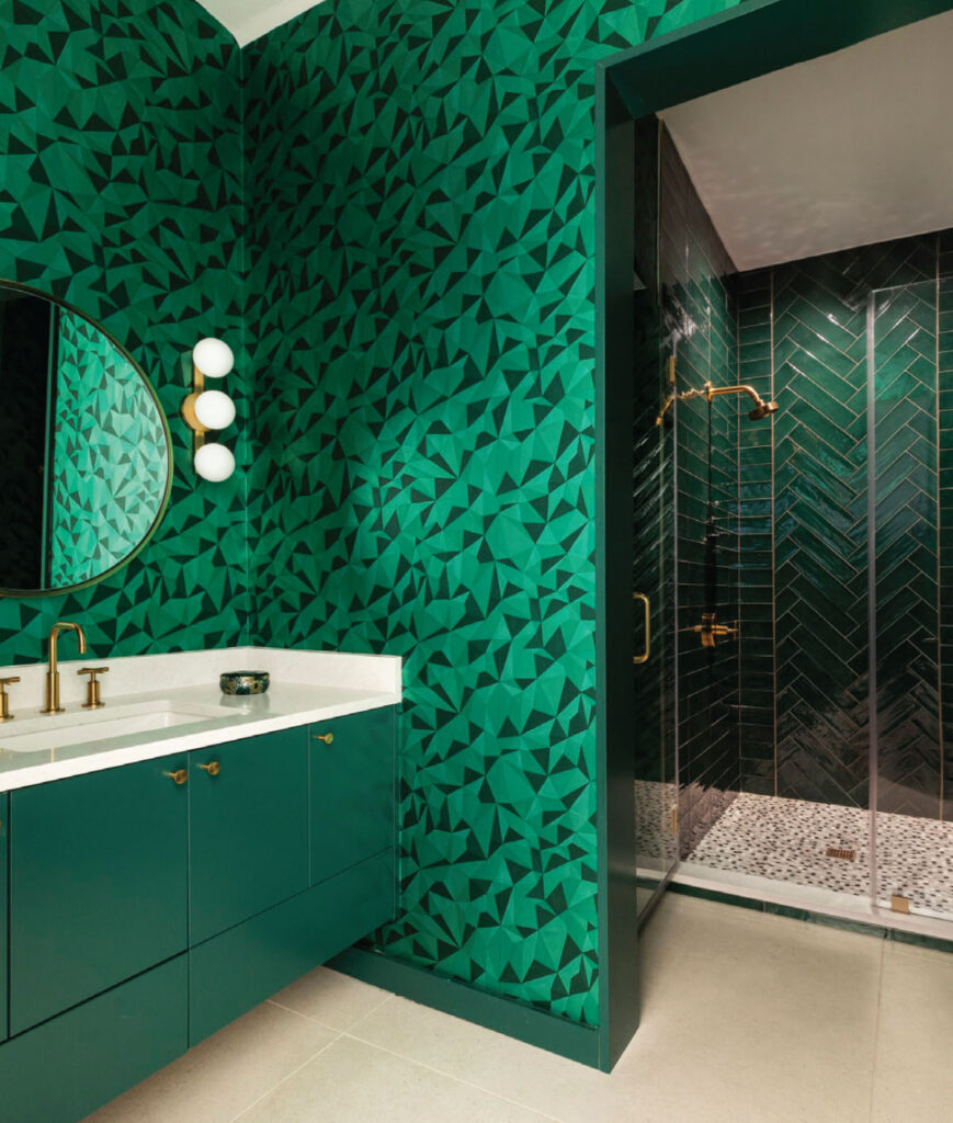
We have also used this color on a recent project for our client in the University Place area. It was a completely different style home with mid-century features. However, the color complemented the furnishings very well. Our clients also were up to the challenge of creating a showstopper bathroom. Using color is how we managed to create a gorgeous space. Our team selected a Cole & Son Curio Quartz Emerald wallpaper with gold accents for the plumbing and hardware and complemented it with SW 6454 Shamrock on the cabinets. Then we took the use of color even further and placed fabulous Gioia Avocado subway tiles on the shower walls, some laid straight and some in a herringbone pattern, and a green and white penny tile on the shower floor. We were lucky to find these oversized green subway tiles in a perfect green to blend with the wallpaper. This bathroom was definitely extreme and definitely beautiful!
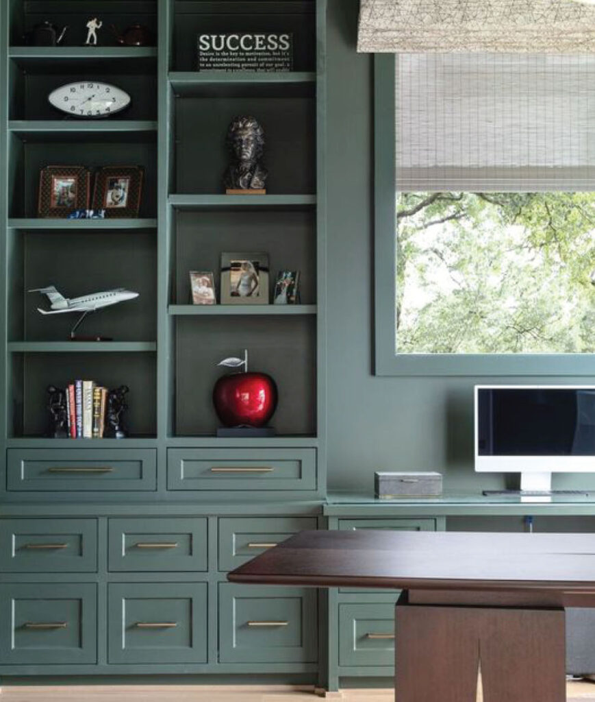
If you prefer a wonderful accent color for a special room in your home, another paint color we love is SW Laurel Woods 7749. This gorgeous, rich shade blends beautifully with warm woods and transitional furnishings. We used this color in our client’s home office in Garden Oaks, and it looks stunning!
BRINGING COLOR INTO YOUR HOME WITH FURNISHINGS
Bringing color into your home with furnishings is a great way to personalize your home as well. One of our favorite clients recently moved from her townhome in the Montrose area to a house in the Heights, and we were able to use most of her furniture in the new house. Some of her furniture will be used in her new office, but the majority was placed in the new home. (New photos to come soon.) She loves color, and we were excited to help her carry out her vision for her townhome.
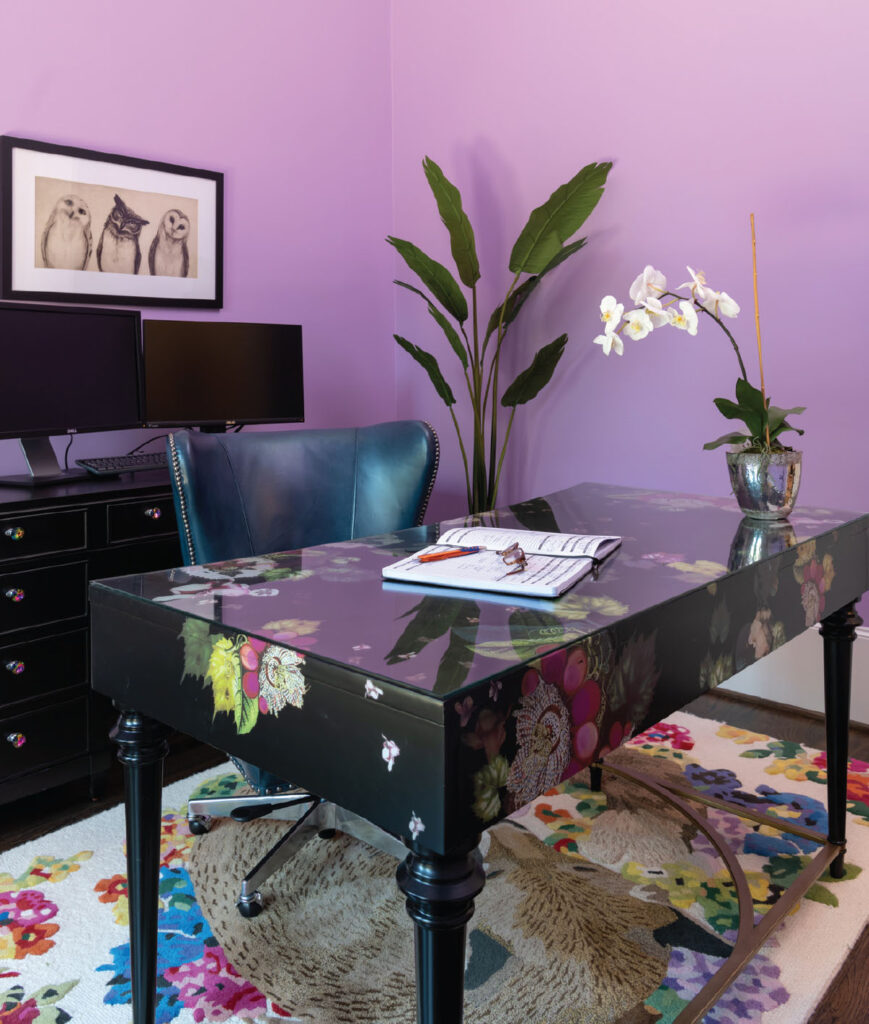
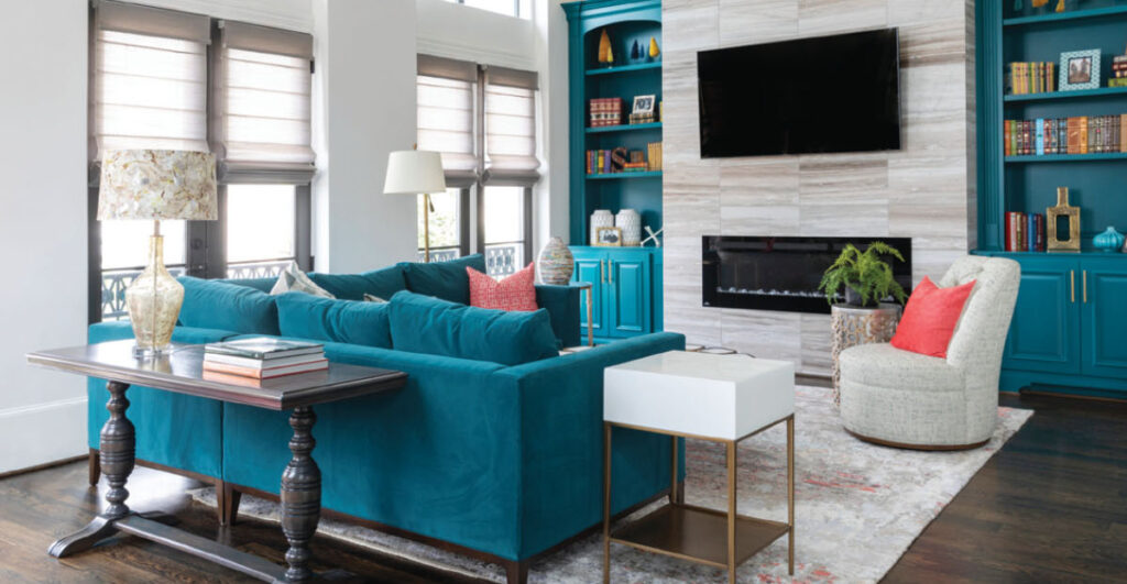
We selected a black desk for her home office with a floral print to complement her “Fox” rug and painted the walls SW 6829 Magical. We then painted the living room bookshelves SW 9059 Silken Peacock and complemented them with a deep teal sectional and multicolored rug.
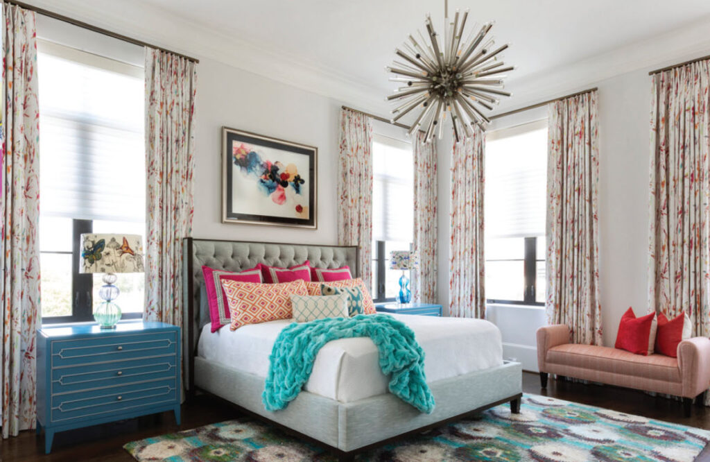
We used colorful printed fabric for her primary bedroom drapery, coordinated colorful shams for her bedding, and added a unique patterned rug to finish it off.
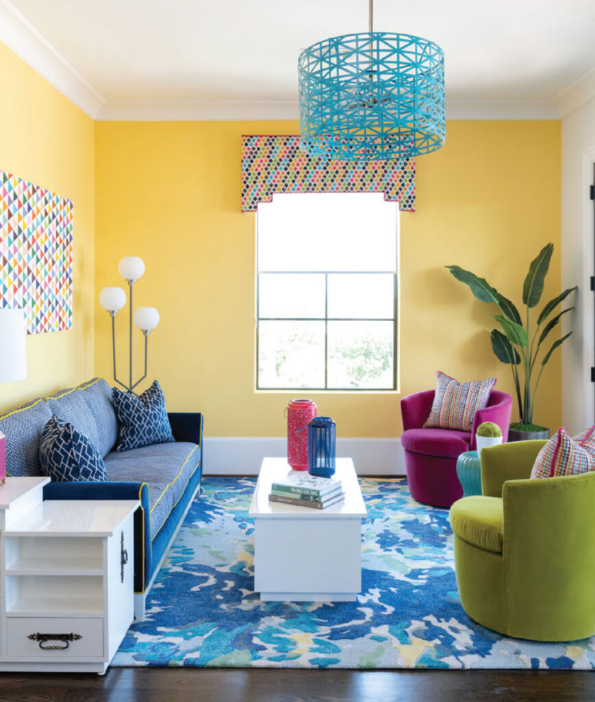
We painted accent walls in her game room SW 6688 Solaria and then painted the accent shelves each a different color. To complement the space, we went with a beautiful deep blue sofa, a colorful rug, and citron green and hot pink swivel chairs. It was so much fun!

DON’T BE AFRAID TO ADD COLOR TO YOUR HOME
Our major takeaway? Color sets the mood for a space. How do you want to feel, or what kind of ambiance do you want to create for your living spaces? Whether you select a tranquil and quiet aesthetic or a fun and vivacious one, it should reflect yourself and your lifestyle. If you can’t decide on a color, call us, and we will be more than happy to help you.
Until next time, let your creative juices flow!
About the Author
Principal of Pamela Hope Designs Interiors
Pamela O’Brien is an award-winning luxury interior designer, writer, and speaker.
Before founding Pamela Hope Designs, O’Brien served as a spokesperson in media and public affairs and contributed to programs including Dateline NBC and 48 Hours. O’Brien attended a professional development program at the Harvard Graduate School of Design. She enjoys educating audiences through writing and speaking is a member of the American Society of Interior Designers (ASID ). For more go to www.pamelahopedesigns.com
